Living Coral. More Than Just a Dream // YUN Journal
|
Erschienen am 05. März 2019 auf YUN Journal
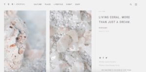
ON PANTONE’S COLOUR OF THE YEAR.According to the Pantone Institute the new trend colour of the year is Living Coral. Annually, the decision results from a trend analysis in fashion, design, social media and other fields. But, there is also something very special about this years tone, which made us fall in love with it long before the official announcement. “An animating and life-affirming coral hue with a golden undertone that energizes and enlivens with a softer edge“. The Pantone Colour Institute has announced its trend colour for 2019. Living Coral, also called PANTONE 16-1546, is a vibrant, yet mellow tone, which not only reminds of the mesmerizing colours of the underwater world, it also promises to offer some idyllic warmth within the cold winter months and welcome spring with a lovely hug. In other words: a colour to dream, a colour to shine. A mixture of Red, Orange and Pink This becomes even more obvious when having a closer look on the colour spectrum itself. Coral as a mixture of red, orange and pink combines the three warmest colours. But even more interesting are the different characteristics that come together: While red is meant to be a strong colour, full of energy, the colour of monarchs and sometimes even considered a little aggressive, orange mostly stands for happiness, joy and youth. Pink is the softest one of these three. In history, it had been considered the colour of princes and little kings. Later it became related to so called female attributes such as softness, positivity and calmness. But no matter which gender we have: when we fall in love or when we feel really good, we see the world through rose-tinted glasses. |